OK so this is just a short little post, but I wanted to tease something that I'll be writing about in an upcoming announcement on the website 
So, ages ago we were talking about what we might want to do for the next supporter tier, and we had a couple ideas flying around. Scarves, pillowcases, OC-themed dice, even some other more mad ideas, but also mouse mats! I went to explore and look for a good place to find decent mouse mats, and I found a great place.
When we were talking about the OC mousemat, we knew we wanted something simple. We don't really have any artists on hand so we can't afford to go all out with something wilder, so we thought what would work is a black / dark background, with the OC logo in the corner. Just something sleek and neat that people could use at home or in their office, without it being too distracting.
So I got to work.
The basic idea was something like this:

A simple dark background, 1 accenting decal on the top side, and the OC logo in the corner.
Then I was experimenting a bit with different backgrounds, I came up with this wave design but I didn't really know what would go with it. The squiggly line was just a placeholder for an actual decal, but I couldn't come up with something that wouldn't absolutely clash with the waves.

The wave design is already so busy that the decal should be super simple, and after waffling about with various stuff for a while (that I wish I'd saved to show off now  ) I just scrapped that idea and tried something else. I figured I would try to add a splash of color to the background and maybe play with irregular patterns a bit.
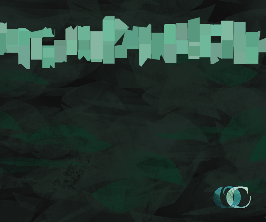
I liked the concept, but not the execution, and felt it needed a little bit of polish. So I worked on another version of this and ended up with our final version:
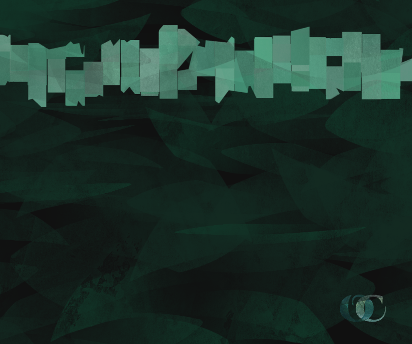
It's sleek, it has irregular patterns, the background has a decent splash of color while the front decal isn't too garish, and the logo is smaller and fits in better than in the above version. So, thinking I was done, I decided to sleep on it.
...
...
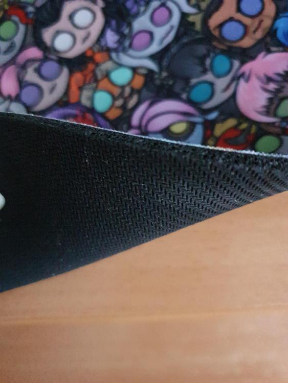
And then the next day I just scrapped everything and tried something crazy
So basically I think we're gonna scrap the above ideas and just go with that!  OK that's it BYEEE




0 Comments
Recommended Comments
There are no comments to display.
Please sign in to comment
You will be able to leave a comment after signing in
Sign In Now